

We’ve seen several NHL teams rebrand over the last couple of seasons.
Some rebrands are more substantial than others, but they’re rebrands all the same. And it makes sense that so many teams have opted for a fresh new look, given the NHL’s new jersey outfitter deal with Fanatics taking effect for the 2024-25 season. This usually results in jersey and logo changes for teams.
Just within the last year, we’ve seen rebrands from the Los Angeles Kings, Anaheim Ducks, Boston Bruins, and St. Louis Blues, who all opted for modernized-retro looks. The Utah Hockey Club’s landing on the identity of Utah Mammoth is an honourable mention, as it partially falls under the “rebrand” umbrella.
We also saw rebrands from the Ottawa Senators in the years prior to last season, as well as on a lesser scale, the Buffalo Sabres and Calgary Flames going back to their roots by resurrecting old colour ways from their 1980s identities.
So with all these NHL teams sporting new looks in recent years, one simple question must be asked: who’s next? Which teams need to follow suit? Well, there are a few.
Washington Capitals

There isn’t a team in more dire need of a rebrand than the Washington Capitals. Don’t get me wrong, their logo and jersey setup are not ugly by any means. The problem is we’ve been looking at this exact setup since the 2007-08 season: nearly two decades.
They are the only team in the NHL that has maintained the exact same look since Reebok became the official jersey outfitter of the league. And the fix to this issue is painfully simple.
The screaming eagle. The “screagle”. Whatever you may call it, the Caps need to make the jump back to their screaming eagle logo again. But don’t just take my word for it, it’s been the overwhelming consensus of fans for quite some time now, from fans all around the league.
And even the Capitals themselves acknowledge the love and demand for the screaming eagle, as they just released a THIRD iteration of it in just the last few years. The Caps just unveiled their new alternate jersey; another screaming eagle sweater.
However, this version is a completely new and original design. Not a revival or re-work of any old-time jersey from the past. But once again, the reaction from Caps fans and fans around the league is overwhelmingly positive regarding the unveiling.
So the demand to make the screaming eagle permanent again is clearly there, and the Caps evidently know this. So why haven’t they? Some speculate they are waiting for Ovi to retire, and with the end of an era, a page will turn for the team’s identity as well.
But we all know Alex Ovechkin. He could easily play in the NHL for several more years, and would the Caps really wait that long for a rebrand? It’s already been nearly two decades. But who knows, maybe they won’t wait much longer at all. Maybe there’s another reason at play here. All I know is the team desperately needs to refresh its look. They need to bring back the screaming eagle full-time. It’s beyond time.
Columbus Blue Jackets
The only other team in the league with as tired of an identity as the Washington Capitals, is the Columbus Blue Jackets.

The Jackets have also not had any significant changes to their look in almost two decades, dating back to the Reebok takeover in 2007-08, just like the Capitals. That’s not to say they haven’t at least made some changes to their jerseys. Different shoulder patches and a change in pant colour for their road setup is where the tweaks end, though.
Once again, there’s nothing necessarily wrong with the Columbus Blue Jackets’ jerseys and logo, and they have stood the test of time pretty well. A lot better in my opinion than the Caps’ setup. The problem is they’re just straight up boring. And now, after nearly two decades of use, it’s time to shake things up.
Most recently, for the 2025 NHL Stadium Series, we saw some sharp new threads from the Blue Jackets. These jerseys featured the infamous cannon as the logo on front, with fresh, newly designed shoulder patches. All with the usual navy, red, white and silver colours that have come to be a staple for the team. And although nothing about the jersey is too exciting or different, the composition of it all breathes some much-needed new life into the team’s appearance.
Columbus’ Stadium Series jersey is proof that the Blue Jackets can think outside the box and do so much more with their identity. It’s just a matter of actually going forward with that change. When will that happen? Your guess is as good as mine, but hopefully it’s sooner rather than later. An identity change might be exactly the sort of thing a rebuilding team on the cusp needs.
Nashville Predators
It’s more of the same for the Nashville Predators. Similar to Columbus, the Preds have a great logo and a history of some elite-looking threads from the early 2000s when they entered the league. But for several years now, especially since the Adidas takeover, things have gotten really, really bland.

Nashville’s original uniform set was fresh and new. It incorporated a shiny silver material that had never been seen or used before on an NHL jersey. And whether it was liked or not at the time, it has certainly stood the test of time. A similar type of glittery design is still seen today throughout the NHL. Primarily in all of the Vegas Golden Knights’ jerseys, most specifically their current home jerseys.
But since 2011, the Preds have not used that shiny silver material. Instead, they have opted for a primarily yellow colour scheme, which has been their identity ever since. And the colours are fine, but the jerseys themselves have suffered. The designs are very simple, just lacking any real personality. There’s nothing fresh or exciting anymore about them.

And it’s not to say that the franchise simply can’t come up with something better. Once again, like several other teams, the Nashville Predators had phenomenal Reverse Retro jerseys. Both iterations incorporated design language from their original jersey set, and they looked pretty sharp if I do say so myself.
So the Predators know how to design a clean set of jerseys. It seems like it just comes down to whether they want to or not, which I can’t imagine why they wouldn’t. Given the fact that their current threads aren’t particularly loved by many at all.
Winnipeg Jets
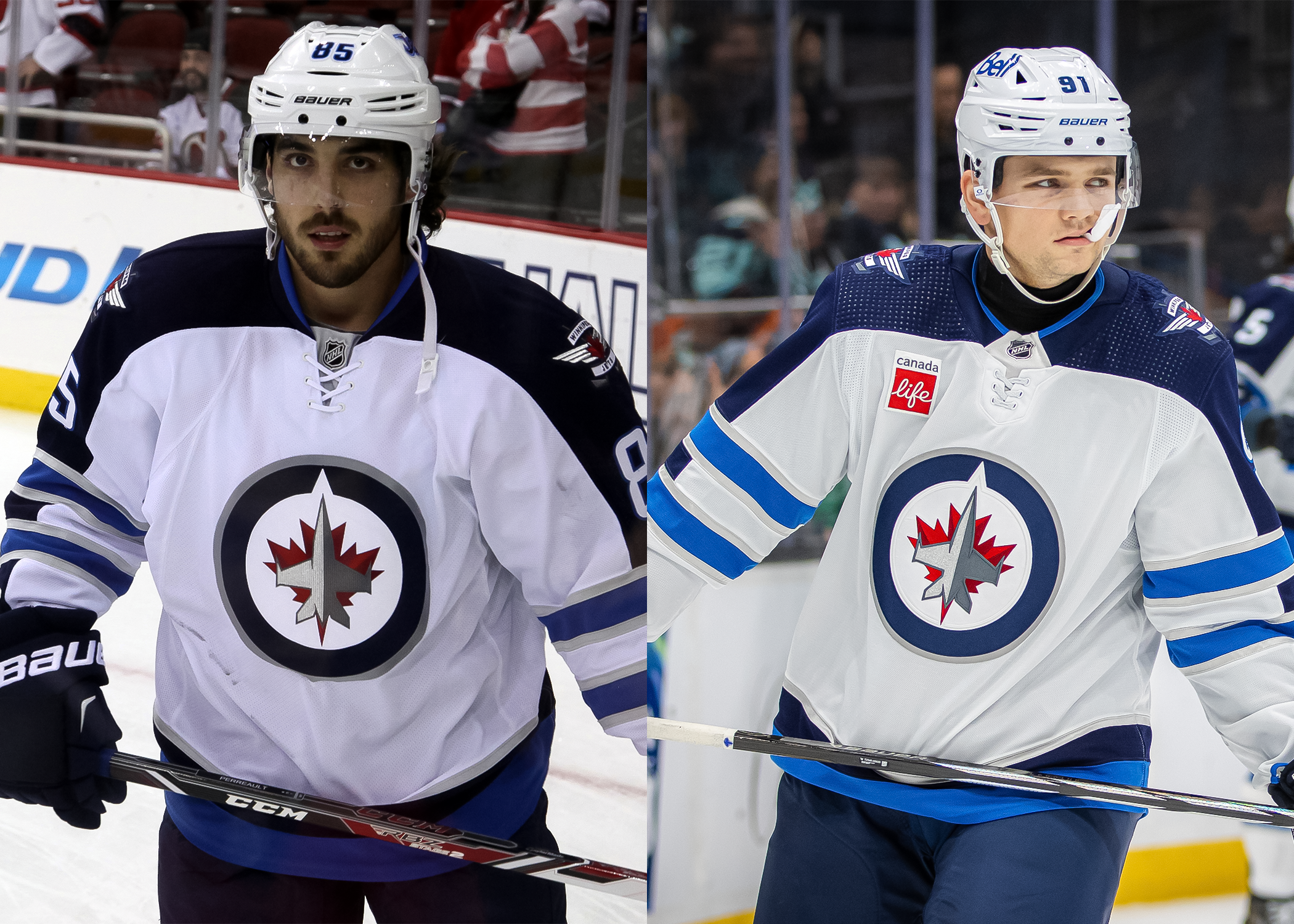
The final entry on this list is another team with a seriously desperate need for a change: the Winnipeg Jets. Since re-entering the league, the Jets have also not changed their home and away jerseys at all. They’ve had the exact same jerseys since 2011, a whopping 14 years already. Similar to the Washington Capitals, the cries for new jerseys are there, and have been there for a while.
Once again, Winnipeg’s jersey situation is not some complex issue to navigate. The answer has been sitting in plain sight for several years now. Back in 2016, the Jets unveiled retro-style road jerseys for the NHL Heritage Classic. It’s safe to say they were a hit, as they then went on to unveil a home jersey version for the 2019 Heritage Classic. And ever since, fans have been screaming for these jerseys to be made permanent.
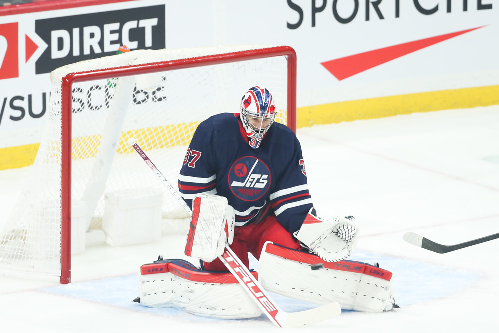
Now I get it, the Heritage Classic jerseys feature one of the original Winnipeg Jets logos. And that team technically no longer exists, as they became the Phoenix Coyotes (current-day Utah Mammoth). I also understand that the current Jets logo isn’t inherently bad, and by logo standards, it is still relatively new. So that begs the question, why not combine both?
It’s so simple, and yet it would be so effective. Plus, if they really wanted, they could reserve their current home jersey as an alternate, perhaps? Either way, they have some options. All I know is they need to pivot away from their current threads. They served their time very well. But just like the team trying to turn the page in the playoffs, they can also turn the page regarding their look, too.


